
Case Study

Venmo Charities
Roles:
Project Manager, UX Designer, Visual Designer
Timeline:
2 Weeks
Client:
Venmo
Tools:
UX Research, Figma, FigJam, Maze, Notion, Google Slides
Team:
Carl Fetus, UX Researcher & Visual Designer
Hannah Truckenbrod, UX Researcher & Designer
Ky Freeman, UX Researcher & Designer
Introducing, charities to Venmo!
Venmo is a digital wallet that makes money easier for everyone from students to small businesses. My team developed how users can confidently discover and donate to charities by inspiring trust derived from social proof. This case study follows how my team innovated new ways to leverage Venmo as a social platform.
Why are we here?
In a 2-week design sprint, my team iterated on Venmo’s recently launched charities feature. We analyzed Venmo’s implementation, business goals, and press releases to develop the prompt for this design challenge.

“61 percent of donors are most likely to hear about causes through word of mouth from their friends and family, and Venmo’s community of more than 90 million customers is social by nature.”
- Denise Leonhard, VP & GM Venmo
PayPal Newsroom
Our Prompt
Iterate a solution that addresses Venmo’s goals of increasing non-profit reach and engagement by leveraging their platform as a social network.
Research
🔎
Research 🔎
Interviews

5
interviews

22-30
years old

18
questions
We interviewed users that used Venmo, donated to charities, or both about their usage and habits. From those interviews, we distilled their ideas into main points and sorted them into an affinity map.
Trends and Pain Points

Active donors make regular payments to the causes they care about.

Venmo users enjoy the visual social engagement.
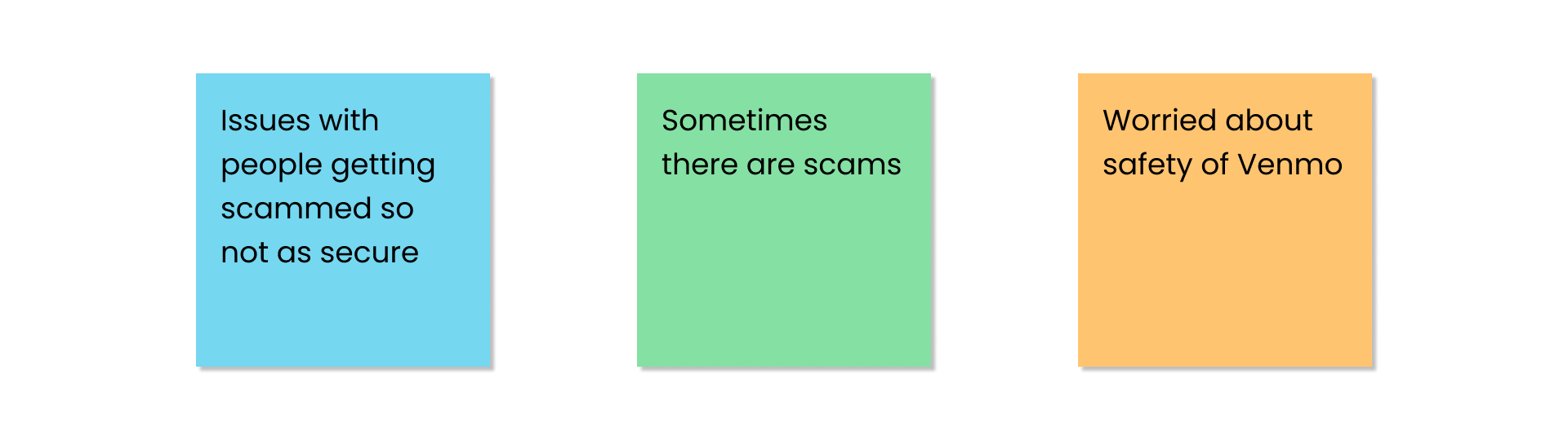
Users have no confidence in security and scam profiles on Venmo.
After identifying these trends from our affinity map, we were able to define Venmo’s needs and problems for both their platform and charities.
Problem Statement
Venmo needs a way to leverage their social platform to increase charity exposure and engagement to establish trust and confidence in their users.
Ideation
🧠
Ideation 🧠
Rough Sketches
We brainstormed by quickly sketching out our ideas in rapid succession.
Discovery Feeds

Brainstorming methods to use Venmo’s social platform to promote charities, we sketched out how other platforms deliver new content for their users to discover.
Content Blocking

In order to ensure users could see vital features and information, we sketched out screens throughout the checkout flow. In doing so, we were able to estimate how much space to dedicate to each content block and if it was visually comprehensible.
Digital Sketches
We began refining our ideas to visualize them within Venmo’s UI.
Social Discovery

Recalling what Venmo does well, we came up with ways to incorporate Venmo’s visual social emphasis into how users discover new charities.
Charity Distinctions

With fake profiles and scams as a concern, we tried to incorporate visual differences between normal profiles and verified charity profiles.
How Users Will Discover and Donate
With key features in mind, we outlined how users will discover and donate to charities that matter to them.
Before
After
Implementations
📱
Implementations 📱
Addressing Pain Points & Trends
Schedule and Automate Donations
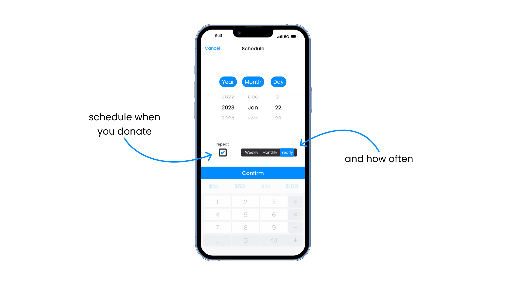
In our research, we found that active contributors to charities donated to charities regularly with automated payments via their bank. Currently lacking this feature, we implemented it in our iteration so Venmo users do not leave the platform.
Trust and Engagement With Social Proof

As Venmo highlighted, people discover and donate to charities through word of mouth. As both a social and financial platform, Venmo promotes charities based on social engagement and to donate to charities scrutinized through social proof.
Verified Charities

To address security and veracity concerns, we elaborated on PayPal’s, Venmo’s parent company, verification system. From the discovery to payment phase, users can consistently distinguish that who they are donating to has been vetted by PayPal.
Responsive Design
Charity Previews

To optimize the number of charities on a mobile screen, users can toggle between minimized and extended cards to learn more about charities before being redirected to charity profile pages. For tablet screens, because items are more legible and there is more space the cards are permanently extended.
Date Pickers

For mobile displays, users can swiftly scroll to schedule their payment. For tablet displays, users can pick a date to schedule their payments with increased visualizations.
Iterations
🔁
Iterations 🔁
Usability Testing
We conducted a usability test on our mid-fidelity prototype. Participants were asked to select a charity organization of their choice and to send them a donation.

9
participants

44.3%
misclick rate

100%
success rate
Why the high misclick rate?
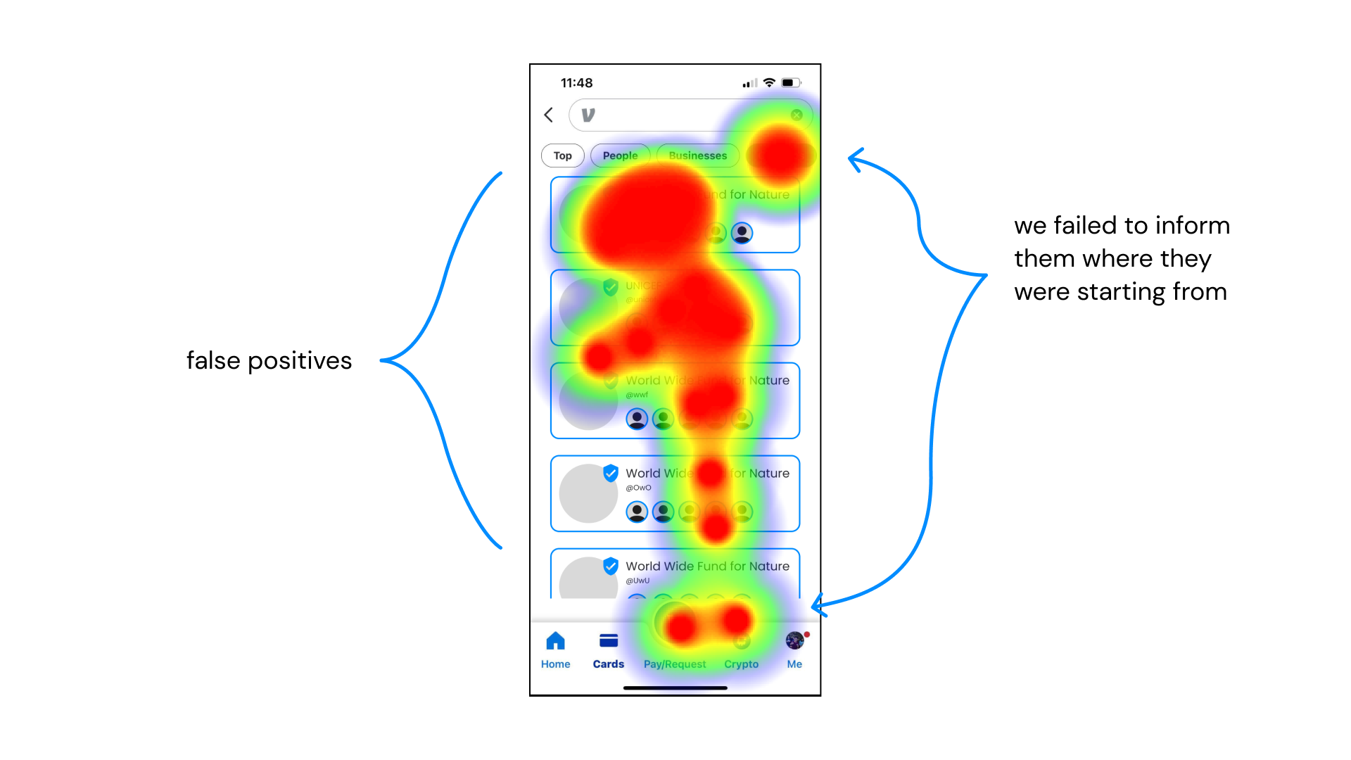
In setting up an asynchronous usability test, we failed to identify all of the possible paths. This led to a majority of the valid paths being counted as misclicks. With higher scrutiny and examination, we identified where users genuinely misclicked, false positives, and assumed explanations based on their taps.
The Major Changes
While we lacked actionable metric data, we received valuable feedback from live testing and written feedback forms. It is from that feedback, and insights from design principles, that we iterated upon our prototype.
Guided Interactions

In an oversight with the mid-fi prototype, we neglected to prompt users to tap on the card to navigate to a full profile page, regardless, we found all users instinctively did so. After follow-up interviews, we found it was a habit users do when exploring mobile applications. Unable to determine if this were a universal attribute, we added a prompt for those who did not have such intuitions.
Adapting for Mobile Displays

Reviewing our checkout process, we found lapses in affirmation when scheduling and automating payments which weakened the users’ conviction in the process. Because this was seen more as a 2-in-1 feature, we created distinct visual differences in the appearance of whether repeating payments were enabled.
Default and Active States

After expanding our understanding of the nuances in designing for mobile displays, we revised the way users schedule payments for our mobile experience. We converted our date picker from a monthly calendar to a scrollable selector. We found that this was easier for users to select a date from a smaller screen.
The Final Prototype
🏁
The Final Prototype 🏁
Moving Forward
⏩
Moving Forward ⏩
The following are features and ideas that we were unable to fully flush out for the final prototype due to time and project constraints.
Charity Tags

While the foundation of our implementation relied on charities recommended based on social habits, we still wanted a way for users to sort and search for charities. Creating a searchable tagging system to categorize and label charities put more freedom back into the users’ hands. These tags could be found on charity profile pages which can navigate you to filtered searches or can be sought in the search bar.
Reflection
🪞
Reflection 🪞
Project Planning
By immediately communicating and establishing a working agreement incorporating our availability to work and how much each of us could take on, we were able to set comfortable deadlines that we consistently met. In addition, with catch-up days to margin the end of the project and consistent communication we avoided working outside our agreed hours and never rushed our deliverables.
Ruthless Prioritization
Defining pain points, trends, and a problem statement we had clear goals for our minimum viable product (MVP). With so many ideas and very limited time, defining an MVP determined what features to prioritize when assigning and planning our schedule.
Guided Mediation
With a short timeline and a group of recently met collaborators, team cohesion was especially precarious for this design sprint. With a mutual vision for the outcome and goals of the project, in moments of disagreement and friction I could always resolve disputes by guiding the conversation back to why they wanted to do this and if it aligned with our fundamental objectives.